How to Check Real-Time Server Latency in the PUBG HUD
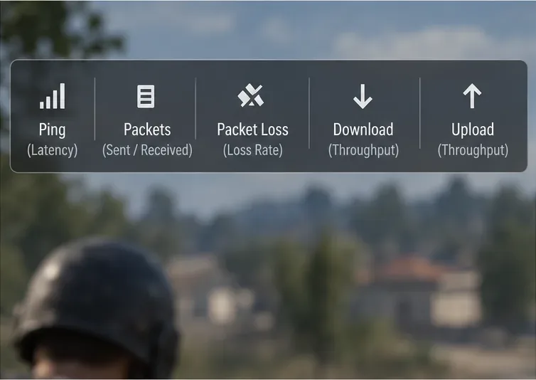
Enable PUBG’s network statistics HUD to monitor ping and packet loss in a match. See where to find it, what the numbers mean, and what they cannot diagnose.
For a practical starting point in Rainbow Six Siege, try a yellow reticle at 100% opacity. Keep it if you can locate the aiming point immediately against both bright and dark backgrounds. If yellow blends into the scenes you play, compare blue or turquoise instead. Lower opacity only when the reticle remains easy to find but feels too dominant over small targets.
These are starting recommendations, not a universal competitive preset. The best HUD optic color and opacity depend on your color perception, display, lighting, and chosen sight. A configuration that looks clean in a settings menu can become difficult to read against a doorway or pale wall.
Source check: October 7, 2026. Ubisoft's Rainbow Six Siege Accessibility Spotlight confirms customizable reticle color when aiming down sight. Its accompanying accessibility screenshot shows HUD Colors, a Reticle color row, and Reticle Opacity. The advice below uses those controls rather than treating every HUD color option as an optic setting. No controlled accuracy benchmark or universal winning combination was verified.
The HUD, or heads-up display, includes information presented over gameplay. The reticle is the aiming mark inside your sight when you aim down sights, commonly abbreviated ADS. Reticle color changes that mark; opacity determines how solid or transparent it appears. At 100%, it is fully opaque. Lower values make it more transparent.
Team colors, objective-marker colors, and chat-background opacity serve other purposes. Changing those settings is not a substitute for adjusting your sight's aiming mark. You can prefer one team-color arrangement while selecting a different reticle color for visibility.
In the accessibility layout pictured by Ubisoft, look under Accessibility Options > HUD Colors. Weapon Sight Colors contains Reticle, while Weapon Sight Visuals contains Reticle Opacity. Older guides may call these Optic Color and Optic Opacity. Use the labels in your installed version, save with Apply Changes, and confirm the result while ADS with the weapon you actually use.
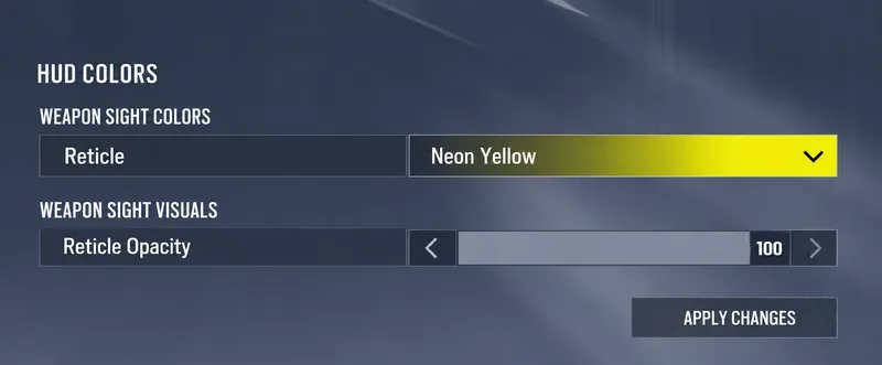
Choose for separation from the background, not for how attractive the color looks alone. There are two useful questions: can you find the aiming mark without searching for it, and can you still see the target beneath or beside it? A color that answers only the first question may be visually distracting; one that answers only the second may disappear when you need it.
| Candidate | When it is worth trying | What to check before keeping it |
|---|---|---|
| Yellow, including the pictured Neon Yellow option | A strong initial candidate when you want an obvious aiming mark. | Test pale walls, warm lighting, and yellow objects for background blending. |
| Blue | An alternative when yellow is uncomfortable or difficult to distinguish. | Check blue surfaces and shadowed areas; the color must remain visible to you. |
| Turquoise | A different candidate if blue or yellow does not provide reliable separation. | Compare against cool-colored surfaces and bright areas rather than judging one room. |
| Your familiar default color | A useful baseline if your current reticle is already easy to track. | Keep it only if familiarity also translates to visibility across your usual backgrounds. |
This table is a set of comparison prompts, not a ranking based on measured reaction times. There is no need to abandon a familiar color that works consistently. Equally, a popular choice is not worth keeping if you lose it against scenery.
Ubisoft's Y5S3 sights and scopes developer blog documented blue for the Deuteranopia preset, yellow for Protanopia, and turquoise for Tritanopia, all at 100% optic opacity. These labels refer to forms of color-vision deficiency. The same historical documentation described Custom color selection and an adjustable opacity range of 20% to 100%.
That is a record of the Y5S3 implementation, not a promise that today's menu has the identical palette or preset behavior. The newer Ubisoft screenshot uses a different layout. Check the choices available in your current build, and use any relevant preset as a candidate rather than assuming its name guarantees the best result for you.
Judge the setting by practical visibility. If two colors feel similar to you, compare them against several backgrounds at the same opacity. You do not need to identify a medical category to choose a reticle you can distinguish comfortably.
Start at 100% because it gives you a clear reference before introducing transparency. After choosing a color, compare lower values if the aiming mark seems to cover or distract from small target details. This order keeps two separate decisions from becoming one confusing experiment.
| Opacity candidate | Reason to test it | Reason to move away from it |
|---|---|---|
| 100% | Establish maximum reticle visibility and a consistent baseline. | The mark feels too dominant over the details you need to see. |
| 80% to 90% | Explore a modest reduction in visual dominance while retaining a conspicuous mark. | You start searching for the reticle in bright or busy scenes. |
| 60% to 70% | Try a more transparent mark if higher values remain distracting. | Background changes make the center difficult to track reliably. |
The lower ranges above are editorial testing suggestions, not Ubisoft-endorsed performance targets. Use nearby values if your menu's adjustment increments differ. An exact percentage is less important than whether you can repeatedly see both the mark and the target.
Lower opacity does not shrink the sight housing or change its magnification. A large or awkward sight frame is a different issue from an overly solid aiming mark. If the housing blocks an angle, adjusting opacity alone will not remove that obstruction.
Keep opacity at 100% and compare colors first. Look for a mark you can reacquire immediately after shifting your view. Reducing transparency problems by making the mark even fainter is unlikely to solve this particular complaint. Test with your normal camera movement rather than holding still and staring at the center.
Keep the color fixed and try a modest opacity reduction. Pay attention to the edge of the target and the aiming point simultaneously. Restore the higher value if the cleaner-looking view comes at the cost of losing the center during movement. A configuration should support aiming, not merely produce a pleasing still image.
Test both sights before settling on a global preference. Different reticle shapes can make the same color and opacity feel different. Do not assume success with one compact mark proves the setting works equally well with every sight. If a particular weapon's sight does not respond as expected, check its behavior in your build rather than carrying forward old exceptions from historical patch notes.
Use a practice environment with the same weapon, sight, sensitivity, resolution, and field of view for each candidate. Include a light surface, a dark doorway, a colored wall, and a background with several edges or objects. Keep your monitor settings and room lighting consistent so you are comparing reticles rather than two different viewing conditions.
Repeat ordinary aiming tasks: settle on a small point, shift between two points, and move while maintaining the aiming mark on a chosen spot. Record simple observations such as “lost center on the pale wall” or “target detail easier to see at the lower value.” Those notes are more actionable than a single good round or an unexplained preference score.
A hypothetical example illustrates the tradeoff: a player finds yellow easy to locate indoors at 100%, but it blends into a brightly lit wall. Before lowering opacity, that player compares blue at 100%. If blue remains distinct across both locations, it may be the better choice. This is an example of the decision process, not a report of a real test.
A reticle setting is a visibility adjustment, not a recoil fix, sensitivity calibration, or accuracy guarantee. Start with yellow at 100%, compare blue or turquoise when contrast is inconsistent, and test moderate transparency only when it addresses a specific problem. The setting worth keeping is the one that stays readable across the situations you actually play.
Enable PUBG’s network statistics HUD to monitor ping and packet loss in a match. See where to find it, what the numbers mean, and what they cannot diagnose.
Learn how to import VALORANT crosshair codes, compare presets with manual settings and spectator copy, and fix common import issues.
Choose Dota 2 minimap size, hero icons, team colors, and background settings by readability, fewer misclicks, and clear results on your own display.
Fix Fortnite texture pop-in on PC with official steps for GPU drivers, file verification, DirectX 12, high-resolution textures, VRAM, SSDs, and stutter.
Learn what Heroes of the Storm minimap size and position options are verified, improve readability, and choose camera-click controls that suit you.
Set Super Smash Bros. Ultimate Quickplay to prefer hazards-off stages. Follow the Preferred Rules menu steps and learn why matchmaking may not always honor them.
Enable Server Latency and Packet Loss in Warzone to monitor connection quality, read the overlay, and use recurring spikes to guide troubleshooting.
Learn how to carry from mid lane in League of Legends by setting up waves, choosing safe roam windows, reading side lanes, and converting pressure into objectives.
Fix Minecraft Evoker spell problems with a safe vanilla test, version checks, log review, and a step-by-step way to isolate mod or datapack conflicts.
Fix PUBG stuck on Initializing on Steam with a focused checklist for PC service notices, launch options, game files, downloads, and connection issues.